
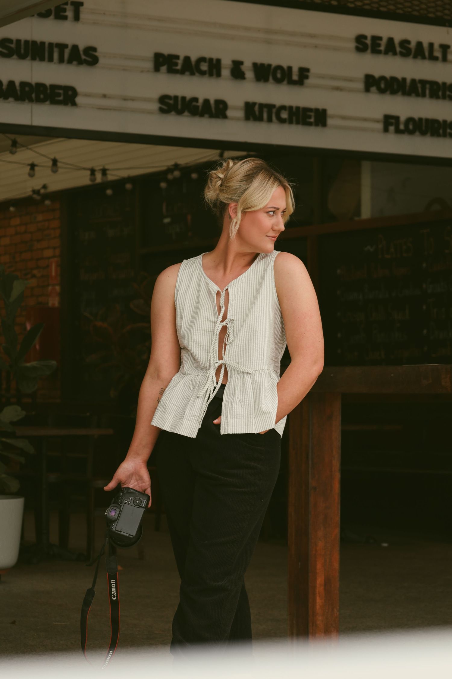
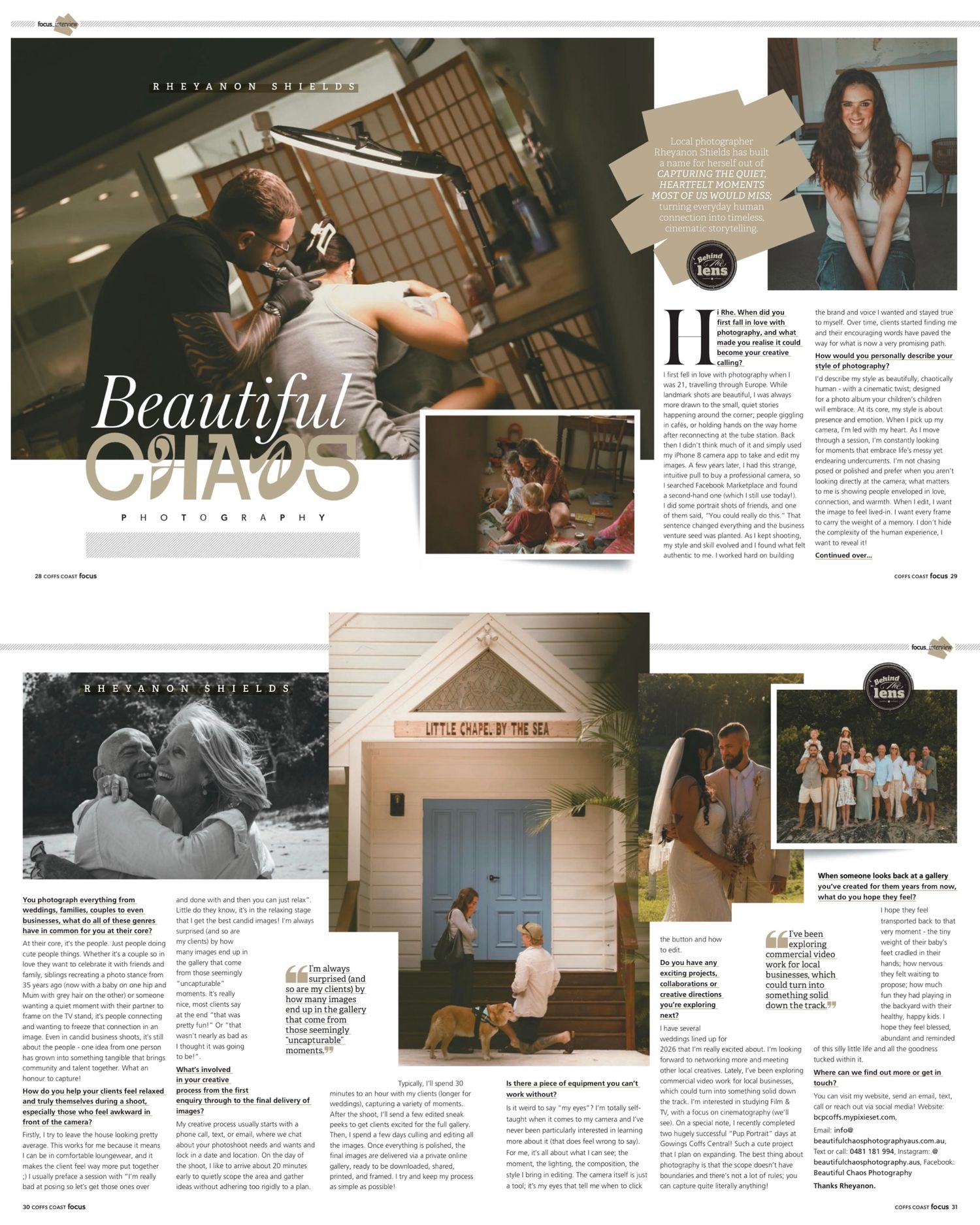
Focus Magazine
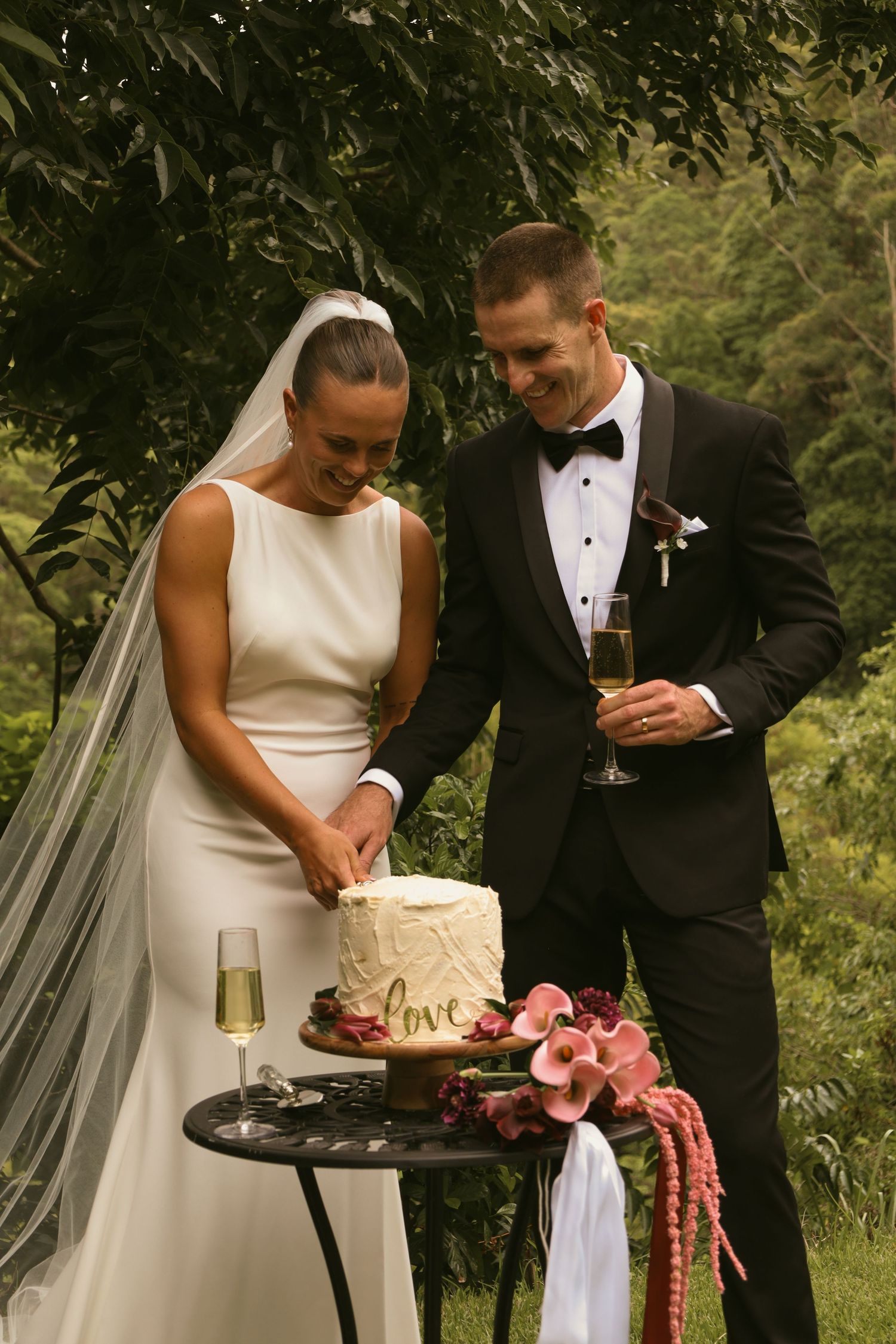
As featured in Coffs Coast Focus Magazine.
January 2026 issue.
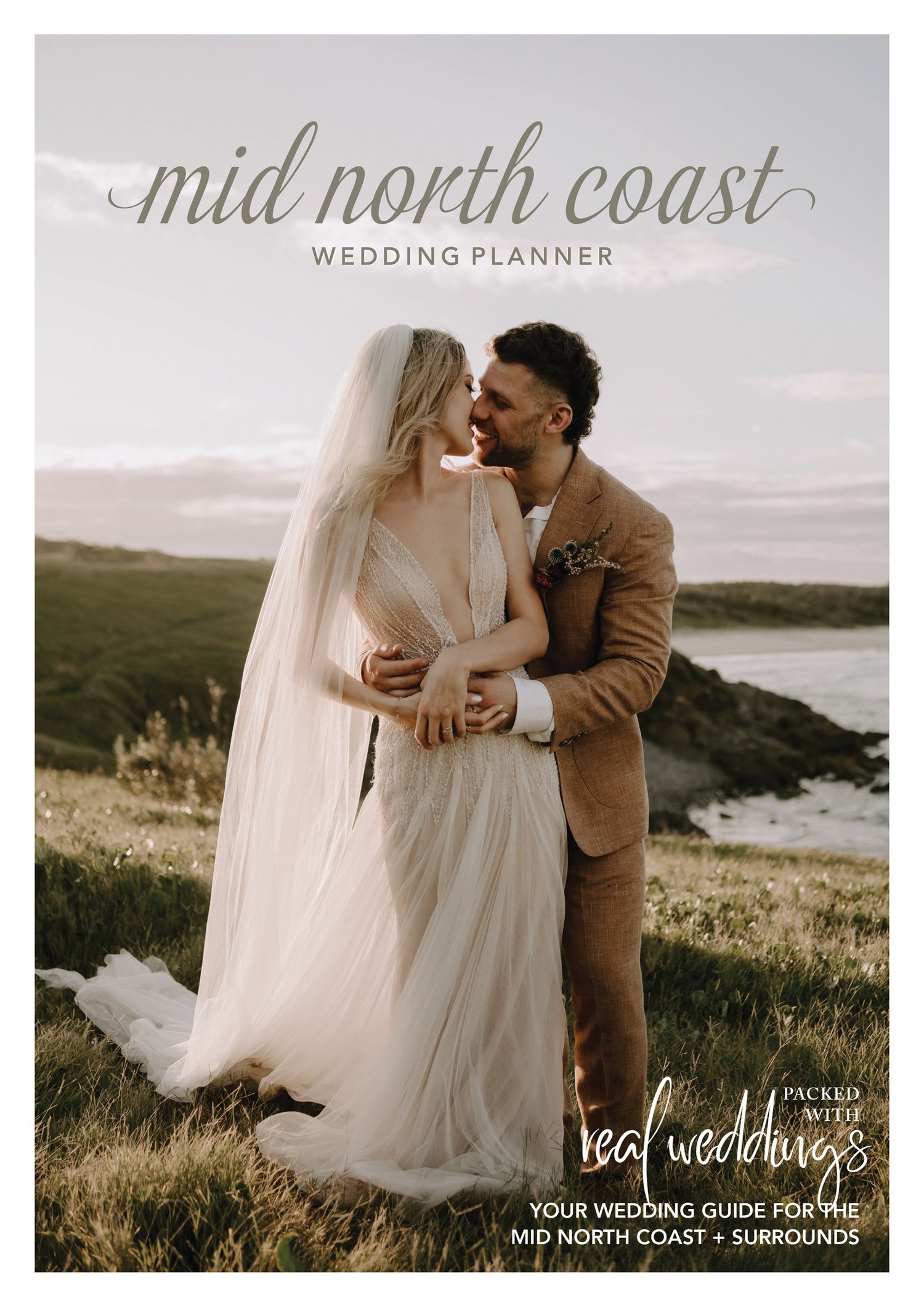
MNC Wedding
Planner Magazine
As featured in Mid North Coast Wedding Planner Magazine First Edition.
The Beloved Journal Instagram Spotlight
As featured on @thebelovedjournal Instagram spotlight
"Busy"
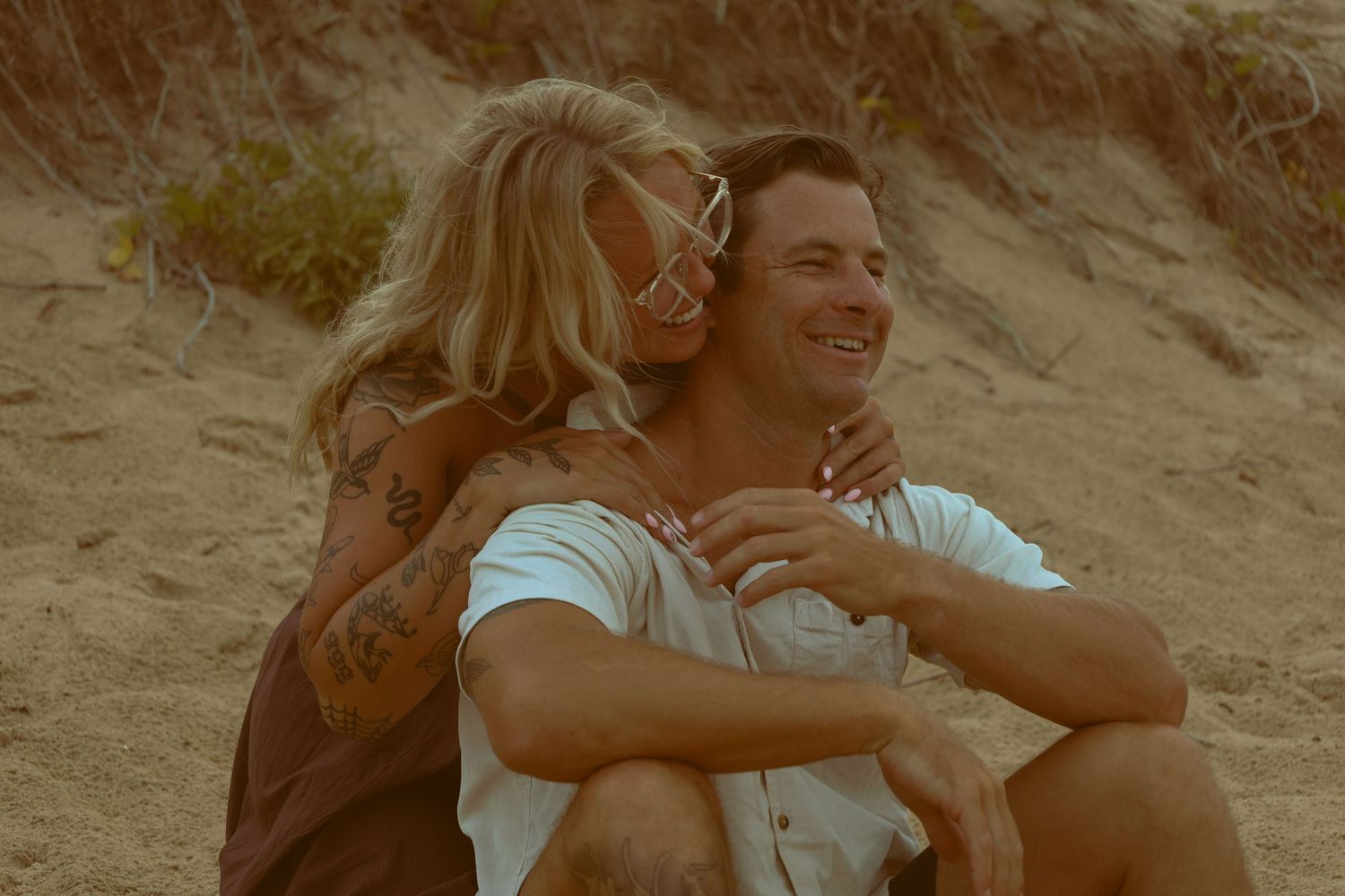
I like to think that my “busy” style is staying true to my branding of “Beautiful Chaos”.
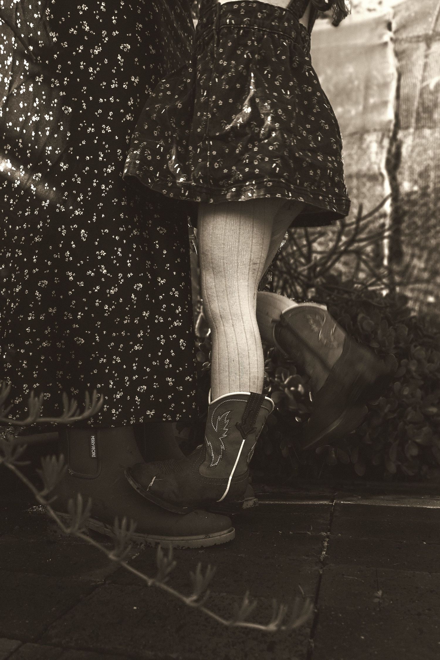
I strive to capture moments that resonate deeply with the viewer; moments that radiate warmth and connection. Each photograph I take is a deliberate composition, where every element is chosen to enhance the intimacy and emotion of the scene.
The backgrounds are intentionally minimised, allowing a sense of togetherness and belonging.
I want the individuals in my photos to appear enveloped in a cocoon of affection; either by others in the photo, or by their environment; never isolated or distant. It’s important to me that when someone looks at my images, they feel the presence of love and support, almost as if they could step into the photograph and be embraced by the warmth within.
This approach is not just a stylistic choice, but a reflection of my belief in the power of human and environmental connection. In a world that can often feel fragmented and detached, I hope my photographs serve as a reminder of the beauty and strength found in close, loving relationships.
"Moody"
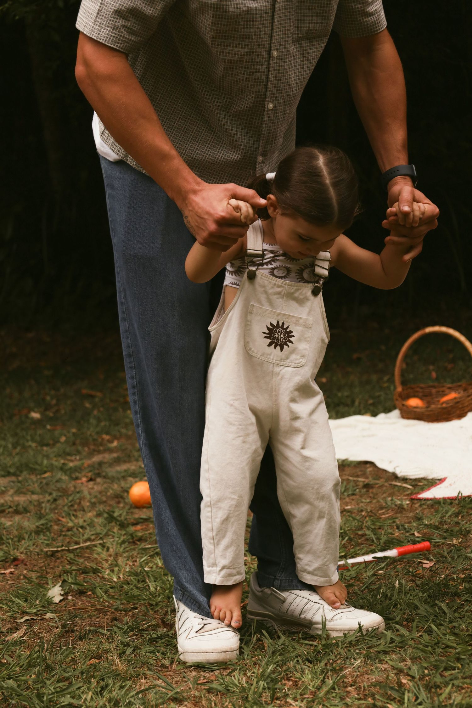
By applying a slightly opaque film / translucent overlay, I hope to add a touch of nostalgia and vintage charm.
Have you ever flipped through an old family album or studied home hallways stacked with crooked framed photos and noticed a recurring theme?
Often, images from the past have an opaque effect due to the use of an older camera, and I find this quite captivating. I believe it makes the people and places in frame feel three-dimensional, relatable yet mysterious, and frozen in time; almost as if you could press on it and the image would come alive.
In a world where information is readily and regularly shared, I am drawn to the allure of creating images that evoke a sense of mystery, imagination and the unknown.
Throughout the use of this effect, I hope to serve a gentle reminder that while moments may pass, their essence lingers, preserved in a delicate vessel of memories; gently veiled yet vividly alive.
"Opaque"
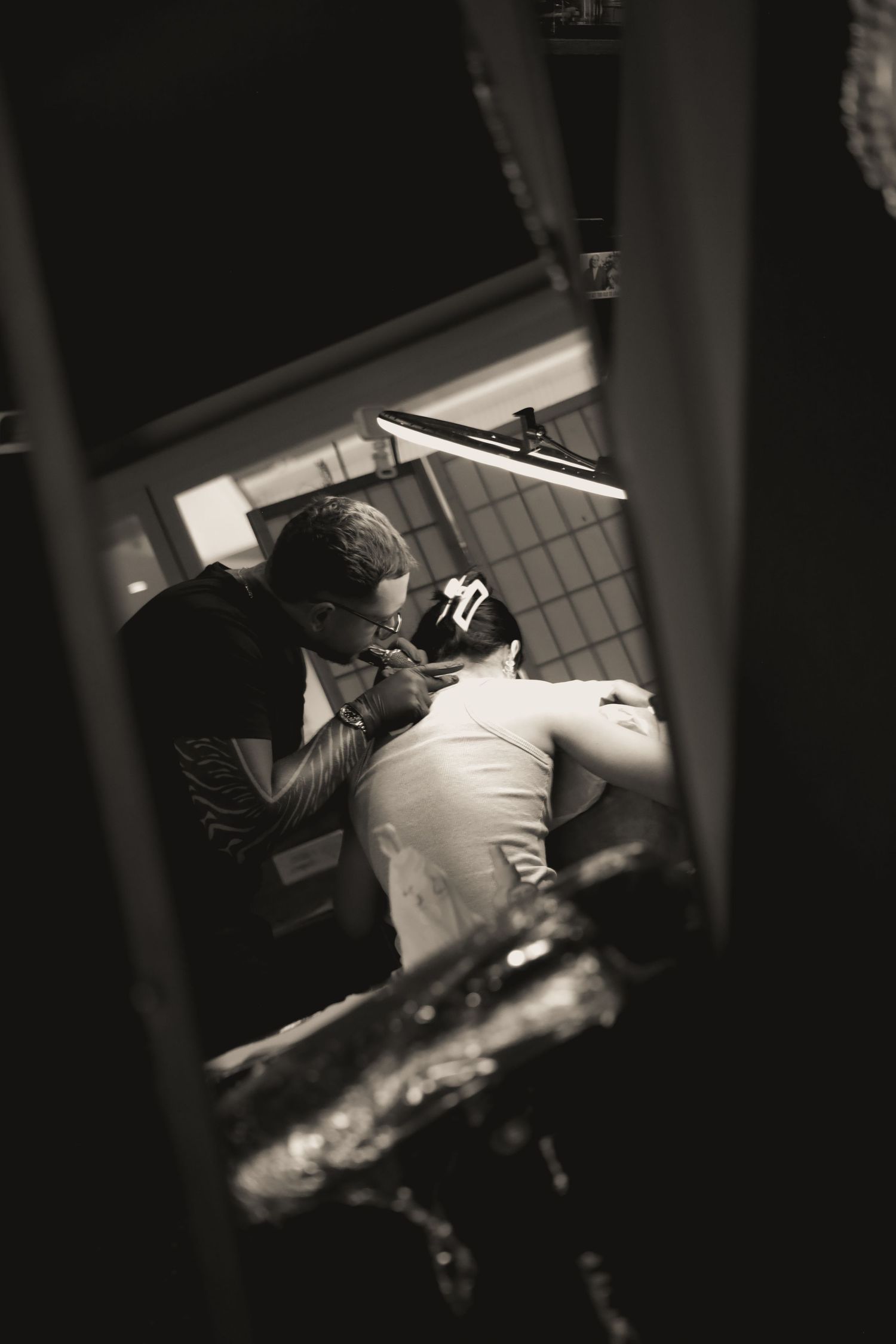
Personally, I find myself less inspired by editing that is too neutral or bright, as it gives the illusion of “clean” and “perfect” when in reality, life and people and emotions and the relationships between those in frame are quite the opposite of that.
Life and people and emotions and relationships are complex, and I believe that the interplay of shadow and light and dark tones adds depth to the narrative, revealing the intricate layers of the human experience.
The dark and moody effect not only enhances the visual aesthetic but also mirrors the internal conflicts and hidden truths that define our existence.
By embracing the imperfect and the unpredictable, I aim to create a more authentic portrayal of life; one that resonates with the viewer on a deeper, more emotional level. This approach allows for a richer, more nuanced exploration of the human condition, capturing the beauty in imperfection and rawness in the everyday.